Assignment 1

From NM2208


Initial concept of this is to create an optical illusion to hide myself in the background. I do not agree visual comm always mean easily visible or know the message at the instance.

However my skill is not there yet to create any complicated drawing. This is the easiest way I found to deliver my message.

Assignement 6

From NM2208


My assignment 6 is about NUS bus system. This is not meant to be according to scale. It just serve as a rough guide of the bus services in campus.

In order to make more uniform and simplify, I abandon to follow the exact map of the campus. I uses all straight lines and form all squares. The challenge in this design is to know which line should be in the inner loop and which should be in the outer loop. If the sequence is wrong, it will leaves gaps in between lines. Hence this work is carefully design.

I have yet put in the legend. I would like to receive feedback before the finaly touch up.

Assignment 5

From NM2208
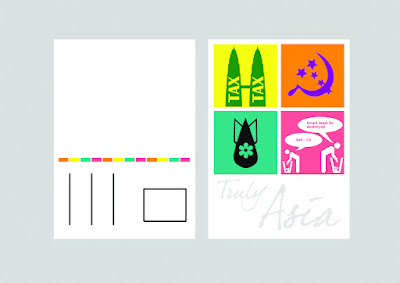
This is my assignment 5, I came out with 4 simple illustration the describe Asia politics in a sarcastic way.

Should I explain each of them? No, I should not. I can only say the last one is about Indonesia and the rest is pretty obvious.

The colours I chose here is totally different color but about the same tone. I would like to know if I am allowed to do that?

If I must use the same range of colours, perhaps I should choose one of the illustration and play with the colours?


The latest update:

From NM2208

Assignment 4

From NM2208

From NM2208

At first I came up with this idea of the pulse line that form the city landscape of Singapore. It symbolizes that the iN2015 Master plan is the vital plan that supports the country's economy in the future. It gives the pulse of the heart of Singapore.

On the day, I had a comment that it has nothing to do with IT and rather too simple.

Hence I came up with another version as the following. I read through the iN2015 website again and notice that the key word for the whole campaign is 'connected'.

In this poster, I exaggerate the campaign to space. The word iN2015 representing a space ship moving towards a new planet. I did not put in any description on the poster, instead I give the link to the IDA website. This is because I think more words will spoile the hormony of the poster.

From NM2208

I have done the poster all by myself in 10 hours with the help of the following tutorials online

Assignement 2

From NM2208

From NM2208
Here is it, assignment 2. I have chosen the card tapping sign for school of computing. In COM1 there is a lot of places that you need to tap you card to gain access and I realize they don't have a formal sign for this.

Simplifying processes
  1. I trace out the whole image, with my hand, card and the machine.
  2. Secondly, I remove the button because it is redundant and blow up the card.
  3. Then I use an rectangle box to represent the image.
  4. At the fourth stage I use the border of the sign to represent the machine instead.
  5. Because of best not to use words, I have come to the last stage